App of the Week: Record Player

There’s An App Like Shazam But For Album Covers


Shazam has proved to be a really useful piece of kit for the casual music listeners amongst us.

Hearing a tune in the background on the office radio or in a store that spikes our interest once upon a time may have ended there. A potentially momentarily frustrating situation if ever there was one.

Along came Shazam to solve such a problem, easing our mysterious musical woes. Just hold your phone up to the sound and the app will tell you what song it is as well as nudging you towards purchasing it on iTunes (support the music man).

It was obviously fairly popular as Apple bought the service last year for around $400 million.

Record Player has seen those successes and applied it to something more visual. Album covers.

The concept is simple. You’re browsing a record store and you see an album that tickles your fancy – however you may not have listened to it properly in the past. Vinyl isn’t exactly cheap so you may want to take the record out for a ‘test run’.

Snap a picture of the cover and the app will use the Google Cloud Vision API and the Spotify API to bring up the playlist on Spotify.

According to Billboard and Nielsen Music, vinyl LP sales have reached a record high, accounting for 14% of all U.S. physical album sales in 2017, an 11% increase from 2016.

Download Record Player for iOS here
Download Record Player for Android here


Do you have a favorite reference app like Shazam or Record Player? Tell us about it in the comments below!!

App of the Week: Trello


By Jill Duffy of PCMag.com

Online tools for collaboration and communication come in a wide variety. Some, such as Jira, are popular among software developers, who might use an agile or just-in-time style of working. Trello takes a different approach and instead uses a kanban-style work methodology, which is highly visual. Trello is an online, collaborative workspace used to manage work of all kinds, whether they’re business projects or personal chores. It works fairly simply, with drag-and-drop capabilities and an intuitive interface. If you’re thinking of using it for true project management, however, consider that it lacks such project management basics as Gantt charts, time-tracking components, and reporting tools. You can add those functions through app integrations and plug-ins, but they aren’t included by default when you sign up for Trello or pay for a premium account. Trello is eye-catching and fun, and it’s a very good collaboration solution for certain types of work and teams. Figuring out if it’s right for your team may take some trial and error, however.

Price and Plans

Trello offers four levels of service: a free account, plus three versions of paid accounts called Gold, Business Class, and Enterprise.

The free account gives you a lot to try without too many restrictions. You can create and manage as many boards, lists, and cards as you want and attach files up to 10MB in size. There are no limits on the number of people who can join your account either. The limitations are that you only get one Power-Up, or integration, per board. Power-Ups include Salesforce, Join.me (for video conferencing), Slack, Zendesk, Github, and so forth. The full list of Trello Power-Ups is online.

In addition to that one integration, you can connect to three different cloud storage services: Google Drive, Box, and Dropbox. With a free account, you only get basic functionality with those storage services, meaning you can add links to files in your Trello cards. If you choose to make one of those storage services your Power-Up, then you get some additional functionality. In the case of Google Drive, you can preview files right from Trello and even create new documents right from the Trello app.

For $5 per month or $45 per year, you can upgrade your free Trello account to a Gold account. There are two serious advantages to having a Gold account. First, the maximum file size for attachments increases to 250MB. Second, you get three Power-Ups (integrations) per board instead of just one. The other benefits, such as custom emoji and more stickers, feel more like in-app purchases for video games than productivity enhancers.

The Business Class and Enterprise accounts are a different story. The major difference between them and the free and Gold accounts are that the top tiers come with admin controls.

Trello Business Class costs $119.88 per user per year, which works out to be $9.99 per person per month. That’s double what it used to be. With this level of account, you get unlimited Power-Ups, a maximum file size attachment of 250MB, and plenty of customization options. The administrator of a Business Class account can specify which users can create boards, with what permission levels—everything from public boards to private boards to boards that are only visible to those inside the organization. Trello Business Class also gives you the ability to invite people to have read-only access to your boards, letting you safely share pertinent information with outside collaborators. You can deactivate accounts of people who have left the organization without wiping out all their historical data, too. Business accounts can integrate with Google Apps, as well.

Trello Enterprise, which uses custom pricing, is meant for organizations with more than 100 people. The Enterprise account comes with everything in the Business Class account, but with phone support, a dedicated contact at Trello, and simplified billing. See Trello’s Enterprise page for more details.
Trello used to be fairly inexpensive, especially for teams smaller than 15 people or so, but as I mentioned, the price has doubled since 2015. Now Trello’s cost is more in line with other business productivity apps, including dedicated project management apps, which offer a bit more. Of course, kanban-style collaboration tools like Trello and true project management apps aren’t the same thing, so it’s not an apples-to-apples comparison.

Nevertheless, it’s good to know how much software that’s in the same general category costs to get a sense of what’s a good deal and what isn’t. PCMag’s two favorite project management platforms, Zoho Projects and Teamwork Projects$49.00 at Teamwork.com have exceptionally attractive pricing. Teamwork Projects charges $49 per month plan (flat fee) for unlimited users, and that plan includes supports up to 40 projects with 20GB of storage space. It also includes interactive (drag-and-drop compatible) Gantt charts and tools for tracking milestones—all the stuff you’d expect from a rigorous project management application. A similar package from Zoho Projects costs a flat $50 per month for 50 projects and 100GB storage space.

Many other project management apps charge per user per month. LiquidPlanner, for example, starts at a much higher $29 per user per month fee (and has a ten user minimum), but it has extensive reporting and billing tools. Comindware Project $9.99 at Comindware, a traditional project management service with slightly more modest capabilities, works out to be the same price as Trello Business Class: $9.99 per user per month.

Getting Started With Trello

Trello and other kanban apps use boards, lists, and cards instead of the timeline-based structure seen in project management apps, which look at projects, tasks, and milestones. Project management is designed for projects that have a concrete end date and a deliverable, whereas kanban boards are designed to help teams manage different kinds of work, and not necessarily finite projects.

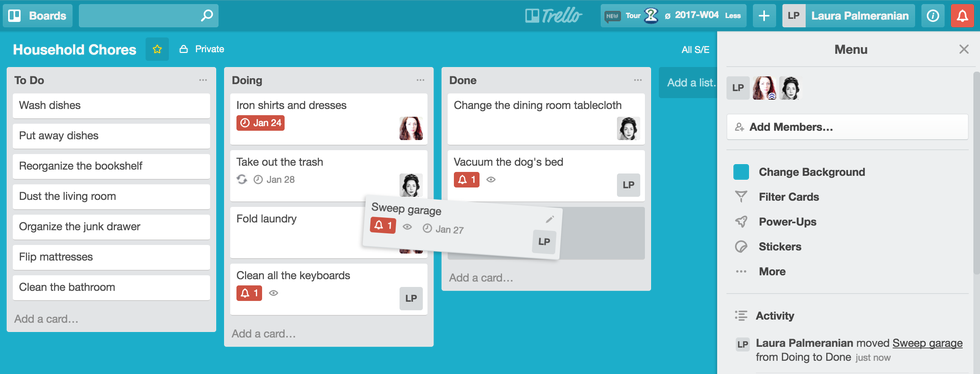
It helps to have an example, and I’ll provide a very basic one. Imagine that you have a kanban board for a family to-do list. You can imagine it as a poster board with sticky notes. There are three columns (Trello calls them lists) labeled To Do, Doing, and Done. In the first To-Do column, family members put cards with a task that needs to be done. Let’s say, too, that the family has decided that each person is responsible for no more than three tasks at a time. (That’s a typical kanban-style rule—it helps users focus.) As family members choose tasks that they will do or are assigned to them, they write their name on the appropriate cards and move them into the Doing column. When a task is completed, the person responsible moves it into the Done column.

From the example, you can glean two major benefits of kanban. One is that the design and rules of engagement limit how much work people can have on their plates at a time, so that they don’t get overwhelmed. The second is that everyone has visibility into the state of the work that the organization (in this case, the family) needs to do. This allows for both accountability and the possibility of helping other team members who are falling behind.

Cards in Trello can have a lot of detail on them. In addition to holding a task and the name of the assignee, a card can have a list of subtasks, due date, a detailed description, hyperlinks, attachments, and more.

Interactivity

Trello is an interactive Web app, with very good drag-and-drop capabilities. For example, if you want to upload images or attach PDFs to a card, you can select them from your computer and drag them right onto the card. They upload in just a few seconds. You can also upload from Google Drive, Box, Dropbox, or a URL. I like that Trello takes any visual assets you upload and adds one of them as a cover image to your card, so that you can easily identify the task whenever you look at the board.

While you can assign someone to a card and set a due date, you won’t find more advanced project management features, such as estimating best- and worst-case scenarios for how long a task might take to complete. It’s also strange to me that cards can’t be checked off as done, even though they can have a due date, but maybe I’m trying to pigeonhole them into being tasks when they’re not. You can archive cards when you’re finished with them, however.

Trello lets you add color-coded labels to cards, but, despite high hopes, I found them to be a letdown. Each label must be color-coded, which means you run out of easily identifiable colors after maybe 10 or 12. I would also rather just see the keywords I chose to use as labels or tags and have reliable tools for searching and filtering information based on them.

As I’ve mentioned, Trello doesn’t have any of its own time-tracking tools, Gantt charts, or progress reports, but you can add some of these features through third-party Google Chrome extensions. I tinkered around with one called Plus for Trello that adds time tracking, reports, and scrum features (scrum is a style of working that focuses on iteration, popular among software developers). They aren’t bad, but they also aren’t nearly as powerful as the native reporting and time estimation features found in LiquidPlanner$45.00 at LiquidPlanner, for example. LiquidPlanner can do things like reconfigure an entire timeline of tasks that are dependent on one another if even one person misses a deadline.

You can connect Trello to other business apps beyond just what’s in the Chrome Extension store. Time-reporting tools Toggl and Harvest both offer integration with Trello. That’s fine if you’re interested in cobbling together a unique suite of tools for your team to use. Many teams will prefer a single package that offers all the features they need in out of the box, however, but there’s nothing wrong with taking the DIY approach, if you have the resources to do it.

One of Trello’s strengths is that there’s more than one way to use it. It’s flexible enough to bend to your will, and you can get rather creative. For example, I created a board in Trello for keeping track of travel ideas. My lists are for different travel regions, and the cards are for specific trips. Inside the cards I have notes about when festivals are happening into those areas, local friends I should contact before arriving, and pictures of the location. I also have a checklist of subtasks, like checking whether I need a visa, booking a flight, booking accommodations, and so forth.

Trello’s flexibility may seem like an asset, but it can also be a burden in that you have to figure out how to best use the service. I have long felt the same way about AsanaFree at Asana, a wonderful task-management tool that has so few rules for how to use it that it can be daunting to new users as they try to figure out how it might work for them. Both Trello and Asana can be excellent tools, but it takes a strong, tight-knit team to put up with some trial and error when first adopting the tool and deciding how to use it.

Apps and Extras

Trello does well with mobile apps. The service offers Trello for Android phones and tablets, as well as iPhones and iPads. There’s also a Trello app for Slack. The mobile apps are nearly identical to the website. On the one hand, that means it’s easy to move from the Web app to the mobile apps. On the other hand, the mobile apps don’t have the same screen real estate, and I find it very hard to use them as standalone products without the Web app serving as the primary interface. In other words, Trello’s mobile apps work best as companion apps to the Web app, not as your main way to interact with the service.

In addition to the many Chrome Extensions and compatible apps you can add to Trello, it’s supported by Zapier and Ifttt. Zapier and Ifttt are services that let you connect online apps and tools that aren’t natively interoperable, and the key is that you don’t need to know how to code to get them to talk to each other. For example, you could connect Trello and GitHub so that every time a new issue is created in a chosen GitHub repository, a Trello card is automatically created on a specified board with the issue details.

Flexible, Visual, and Light

Trello provides a flexible app for managing work collaboratively. Because it’s flexible, however, it may require some experimentation to figure out how to best use it for your team and the workload you manage. It’s a reasonably lightweight, flexible, and focused alternative to heavy-duty Editors’ Choice collaboration tools like Asana, which require far more time to set up, and which can, if not implemented correctly, actually draw your focus away from work. If what you really want is traditional project management software, you might find Trello light on features, as it lacks built-in reporting tools, time tracking applets, and even traditional tasks as you might know them.

Trello is available for Mac, iOS, and Android.


What’s your favorite project management app? Sound off in the comments below!

How to: Master Microsoft Word


By Thorin Klosowski of Lifehacker

Microsoft Word is easily the biggest, most popular word processing program available, but it does a lot more than just edit text and TPS reports. If you’ve been telling yourself that you’ll finally learn Word’s ins and outs, now’s the time to actually learn how to edit styles, add a table of contents, and more.

Get Up and Running with Word Quickly


Of all of the Microsoft Office programs, Microsoft Word is probably the simplest from a user interface perspective. If you’ve ever used a word processing program in your life, you’ll recognize the menus for opening and creating files in the top left corner. The larger menu that runs across the top of the document Microsoft refers to as the “ribbon.” The ribbon has all the formatting tools you’ll need, as well as a few contextual commands that change depending on which tab you’re on.

For this series, we’ll assume you know the basics, but if you want a refresher, Microsoft’s quick start guide for Word gets you through the basics.

How to Do the Most Common, Essential Tasks in Microsoft Word

Of course, everyone’s needs are a little different, but considering most people use Office in an office setting, we’re willing to bet you’ll need to do things like edit styles, compare two documents, prepare a table of contents, and more.Let’s go ahead and cover some of those common tasks.

How to Apply and Edit Styles

A style in Word is a preset formatting for your document. This is what the document looks like, so it includes the font, font size, paragraph style, and so on. Creating or changing a style makes it possible to alter the look of a document all at once so you don’t need to go through and highlight individual sections and make specific changes. You can do things like set a universal heading style,or change what the default bulleted list looks like.

For example, if you’re working on a book, you might get a list of style guidelines from a publisher. Or if you’re working on weekly interoffice memos, a style is an easy to way to create a format guideline so every one you make looks the same way every time. Plus, you get the flexibility to change styles at any time, so if one department likes their memos one way, but your boss prefers a different style, you don’t have to change a bunch of formatting every time you open a new document.

To apply a style, make sure you’re on the Home tab, select a block of text in a document that you want to alter, and then click the Style menu in the ribbon. For example, if you want to make a heading in the middle of a block of text, you’d select the text you want as a heading, then click Styles > Heading 1. It’s as easy as that.

Making your own specific styles is pretty easy too. This is useful when you’re writing something consistently, like a newsletter or a book, and want a specific set of rules you can easily apply to a document as a whole. For example, you might want to change the font size of the default heading option, or change how creating a list works. Here’s how to do it:
From the Home tab, click on Styles Pane.
Click New Style or select the style you’d like to edit.
You’ll get a pop up window to edit a number of parameters here
including type, basis, and formatting.
Click through the options you want to change.

If you’re confused about what each term means, don’t worry, it’s pretty straightforward. Paragraph styles determine the look of the text on a paragraph level.

When you apply this style, it’ll change the whole paragraph. Character styles determine the look on a character level, so you can make one word stand out. Table styles alter the look of tables, like the header row or how the grid lines work. Finally, list styles alter the look of a list, such as bulleted lists or a number scheme.

How to Add a Table of Contents to the Beginning of a Document

If you’re working with a big document, a table of contents adds quick navigation. Thankfully, creating a table of contents in Word is easy and it’ll update itself automatically as you add more to the document.

Word’s automatic table of contents generator takes each heading you add to a document, and then creates the table of contents based on that. If you plan on creating a table of contents, make sure you style each of your section titles with a heading.
Click an empty paragraph where you want to insert the table of contents.
Click the References tab.
Click Table of Contents and then select the appearance you want to use.

That’s it. Word automatically updates that table of contents any time you add or alter a header.

How to Compare and Merge Two Documents

If you have two versions of a document, whether it’s because someone did edits in their own copy, a cloud backup failed, or if you’re just trying to hash out what exactly changed between two versions of the same thing, you’ll need to use the compare and combine functions.

If you just want to see what changes exist between two documents, you can compare them. Here’s how to compare two documents:

Open one of the two documents you want to compare.
Click Tools > Track Changes > Compare Documents.
Pick your original document and revised document files.

Type in a name under “Label changes with” text field so you can tell the difference between the two documents. This way, Word will add a note telling you where each change comes from.

Combining a document works the same way, but the end result is a single document that merges the contents of both documents together so everything that’s the same is overwritten:

Open one of the two documents you want to combine.
Click Tools > Merge Documents.
Pick your original document and revised document files.

When the documents are merged, the differences between the two are highlighted. From here, you can go in and pick what you want to keep in the final version.

How to Format a Document Properly with Tab Stops and Indents

If you’re the type who formats a document by pressing spacebar or tab a bunch of times, it’s time to learn how to do it the right way: Using indents and tab stops. The video above shows off how tabs and indents work so it’s easy to understand, but let’s just sum up what the two terms actually mean.

Tab stops: A tab stop is the location a cursor stops after the tab key is pressed. In Word, it’s a way to easily align text. When you click the ruler in Word, a tab stop appears as a little curved arrow. When you tap the tab key, the cursor and text will jump to that arrow. If you add in multiple tab stops, you can make it so you can format text by simply tapping the tab key a couple of times to get it in place and perfectly lined up.

Indents:
As the name suggests, indents determine the distance of the paragraph from the left or right margin. On the ruler, you’ll see two triangles that adjust the indentation. You can click either triangle and move it to change the indentation. The top triangle adjusts the indentation of the first line of a paragraph. The bottom triangle adjusts the indentation for subsequent lines (aka the hanging indent) in the paragraph. You can also click on the square below them to move both at the same time.
Learning how to use these indents and tab stops can make creating a document like a resume or academic paper a lot easier.

How to Add Citations and References

Academic papers are a beast to write, but Word makes creating bibliographies and citations super easy. Once you’ve created a new document and you’re writing that paper, you can add a citation with just a few clicks.

Click the Reference tab.
Click the Dropdown arrow next to Bibliography style and select the style
you’re using for that paper.
Click the end of a sentence or phrase where you want to add the citation.
Click Insert Citation. In the Create New Source box, enter in all the info you
need.

Once you enter a citation once, you can add additional citations from the same text by selecting a sentence, then clicking the Citations box and selecting the reference you want to insert. When you’re all done, click the Bibliography button and select either Bibliography or Works Cited to automatically generate the reference page for your paper.

The Best Features in Word 2016

Word 2016 is a word processor—that means it doesn’t have to make giant, revolutionary leaps over its previous versions. However, Word 2016 does have a few improvements worth noting:

You can search the ribbon: In Windows, above the ribbon, you’ll see a “Tell me what you want to do” box. Here, you can type in any question you have and Word will tell you how to do it. For example, you can ask it how to insert a picture, how to format text in a specific way, or how to create lists. It’s basically a boring version of Clippy for the 21st century. For whatever reason, this isn’t included in the Mac version.
You can see collaborators edits in real time like in Google Docs: You’ve been able to work on Word documents as a team for a while, but Word 2016 adds in live edits, so you’ll see other people’s notes and updates instantly.
– Smart lookup makes research a little easier: Word is now a little more connected to the web than it used to be. In Word 2016, you can right-click a word, then select “Smart Lookup” from the menu to look up a word’s definition, the related Wikipedia article, and top search results from Bing.

Other than those minor improvements, if you’ve used older versions of Word you’ll be right at home in Word 2016 within minutes.

Work Faster in Word with These Keyboard Shortcuts

Microsoft has full lists of every keyboard shortcut in Word for Windows and Word for Mac that are worth bookmarking,, but let’srun through some of the big ones you’re likely to use every day, and a few specific to word that are really useful:

CTRL+N/CTRL+O/CTRL+S: Create, Open, and Save a document.
CTRL+X/CTRL+C/CTRL+V: Cut, Copy, Paste
CTRL+B/CTRL+I: Bold, Italic
CTRL+A: Select All
CTRL+Z: Undo
CTRL+K: Insert a hyperlink
CTRL+P: Print a document
CTRL+H: Open Find and Replace
Shift+F3: Toggle Capitalization options
CTRL+SHIFT+C: Copies the formatting for selected text so you can apply
it to another set of text with CTRL+Shift+V
CTRL+Shift+N: Applies the normal style to the selected text

Beyond that, Word supports universal text editing keyboard shortcuts like Shift+CTRL+Up/Down arrows to select whole paragraphs. These can make navigating and highlighting text a lot easier, and we’ve got a list of all of them here. If you use Word heavily, get to know these shortcuts, they will make your life better.

Additional Reading for Power Users

Word’s a big program and we can’t cover everything here. Here are a few more guides to help you push the boundaries of what Word’s capable of.

Six tips for better formatting: Formatting is a big deal in MS Word, and if you want to get better at skills like showing hidden characters, dealing with sections, and more, this post should help.
Select all text with the same formatting: This hidden little menu in the ribbon lets you select blocks of text based on its formatting.
Everything you need to know about collaboration: Collaboration is a big part of Word. From tracking changes to learning how to use markup, this post covers everything you need to know about working on documents as a group.
Create your own keyboard shortcuts: Word has a ton of keyboard shortcuts as it is, but if you want more, you can make your own.

Word might just look like a boring old text editor at a glance, but as you can see, it’s a lot more complex than most people give it credit for. Mastering it can take a long time, but once you have the basics and understand what’s possible in Word, you’ll be well on your way to being a Microsoft Word ninja.

What are your best practices for Microsoft Word? Tell us about it in the comments below!

Tips & Tricks: These cool tricks will help you up your drag and drop game on iOS 11

Here are some of the cool things you can do with drag and drop in iOS 11.


By Joseph Keller of iMore.com

Drag and drop is one of the marquee features of iOS 11. You can drag photos, documents, and other items from one location on your iPhone to another, whether that’s between apps or within a single app. While you might have a handle on the basics of drag and drop, there are some cool tricks that you could have escaped your notice.

Here are some of the best tricks that drag and drop has up its sleeves:

Drag within apps
Drag multiple items
Move text between apps
Drag contacts and addresses into Maps
Open links in Safari

Drag within apps


While a lot of Apple’s marketing with drag and drop focused on your ability to drag items between apps, you can also move items within an app. So, copy text from one note to another, or drag photos into a new photo album.
One of the great things about this is feature is not strictly confined to the iPad. While you need an iPad to really take advantage of the full range of drag and drop capabilities, apps like Notes and Files let you drag and drop items on your iPhone as well, as long as you stay within that app.

Drag multiple items


You don’t have to drag things one at a time with drag and drop. If you’re moving something like photos or documents, once you start dragging the first one, just tap others with a different finger and they’ll shoot over to your existing dragging activity. This way, you can quickly move a bunch of related documents into a new folder, or drag photos into a brand new album.

This isn’t just for different file types, either. You can also use this trick when you’re rearranging apps on your Home screen. This way, you can drag multiple apps into a new app folder or a different Home screen at once.

Move text between apps

As a writer that likes to work on his iPad and has to use a lot of quotes, I find this next trick particularly useful. If you’ve got text in one app, whether it’s a note you’ve written down or a section of text from an article or document that you want to quote, you can now just drag it between two apps. Just highlight the text you want to move into your app of choice, then drag it from its origin point into your app.

Drag contacts and addresses into Maps

This is a neat little trick that makes getting directions to a new place easier. If you have a contact with an address that you’re unfamiliar with, you can easily find that address and get directions by dragging that contact’s name from your list and dropping it into Maps. The app will shoot right to that address, letting you then ask for directions that you can then share with your iPhone with AirDrop.
You can also do this with addresses that you find in other apps or anywhere on the web. Simply drag the address to Maps, and you’ll see the exact location and have the option of getting directions.

Open links in Safari

If you’re reading an article or email or something else that has interesting-looking links, you can now drag those links into Safari to check them out. Just drag the link into the Safari app, drop it, and Safari will open that link. Note that if it’s just a new tab with nothing in it, you’ll need to drag your link into the address bar towards the top of the screen.

You can also do this within Safari. Just drag your link, open a new tab, and drop the link in the address bar if you want to have that link and your existing content open at the same time.


What cool things have you discovered about iOS 11? Tell us about it on the comments below!

Weekly Round Up 1/19/18


I love my Nook and my iPad for reading, nothing will ever beat the smell of a new book.

How Technology Is (and Isn’t) Changing Our Reading Habits


White Collar Automation for the win!!
7 Technology Trends That Will Dominate 2018


They can’t stop the Government from deporting people who’ve been here for 30 years, but the Tech industry wants to focus on the spouses of the dreamers?
Tech Industry Urges U.S. to Keep Work Permits for H-1B Spouses.


Wait, what?

Microsoft tops Thomson Reuters top 100 global tech leaders list.

They’re gonna cure us of our iPhone addiction too…
‘Time well spent’ is shaping up to be tech’s next big debate.

They can’t agree on a budget and our kids are eating Tide Pods, but yeah, Washington is gonna close the digital divide.
Washington’s next big tech battle: closing the country’s digital divide.

Preach!!
Sundar Pichai Google CEO Sundar Pichai: Digital technology must empower workers, not alienate them.

A nice idea but, I draw the line at having to but my dog an iPhone.
Pet tech can entertain some 4-legged family members.

Tips & Tricks: This iOS trick no one told you about might keep you from losing your mind


By Zack Epstein of BoyGeniusReport

When Apple released the first iPhone over 10 years ago in 2007, one of the phone’s main draws was its simplicity. The biggest smartphone platforms at the time were Symbian, Windows Mobile, and BlackBerry OS, and they were each overcomplicated messes. “iPhone OS,” as it was called at the time, was a breath of fresh air that made using a smartphone fast and easy. That theme continued to be one of the iPhone’s biggest selling points for years, especially when Apple first introduced the App Store. Installing third-party software on smartphones had previously been a nightmare that involved hunting apps down on websites, downloading them to a PC, and installing them using a sync utility. How crazy does that sound by today’s standards?

As Apple continued to add more and more new features to the iPhone over the years, much of the platform’s simplicity was lost. Now there are so many features that it’s impossible to remember even half of them. It’s gotten to the point where some less savvy iPhone owners aren’t even aware that key features exist. There’s no easy solution, but we always try to share useful tips and tricks as we come across them, and we’ve got a great one for you today.

Some functions in iOS are more user-friendly than others, and rearranging apps definitely isn’t one of the better ones. The concept is simple enough — long-tap on any app icon to enter “jiggle mode,” then drag and drop icons wherever you want — but it’s messy and frustrating in practice. Move too close to a corner and the page will accidentally switch, and forget about trying to drop an app into a folder. Just look at the video from this post on Reddit:

Thankfully, there is a better way and it might just keep you from losing your mind while trying to move apps into folders. As a commenter in that thread explained, it’s simple but it involves two hands. As you tap and hold on one app to drag it around, simply tap on the folder you’d like to drop the app in with a finger on your other hand. The folder will open while you’re still holding the app icon, and you can easily let go to place it in the folder.

This trick works on the iPhone and on the iPad, of course, and it’ll save you a ton of frustration.

Do you have a favorite trick for iOS that keeps you from pulling your hair out? Tell us about it in the comments below!

How to: find your purchased apps in iOS 11


By Charlie Sorrel of Cult of Mac

The Purchased tab in the iOS App Store may seem to have disappeared in iOS 11, but don’t worry — it has only moved. And got a little less useful. Whereas in iOS 10 and prior, your previously purchased apps were found in their own dedicated App Store tab (iPad) or above the list of app updates (iPhone), now they’re accessed by tapping the little silhouette of a head in a circle, which indicates your user account.

Previous purchases on iOS

The Purchases/Purchased section of the App Store is useful for several things. It lets you quickly (or not so quickly, depending on how many apps you have bought) scroll through apps you have bought before, and download them. It also gives access to apps that have been discontinued, either pulled from the store by their developer, or banned from the store by Apple. That’s right — even banned apps remain available to you through the Purchased section.

Where are my purchased apps in iOS 11?

To find your previous purchases in iOS 11, open up the App Store as usual, and then tap the little User Account icon at the top right. This is available in all the App Store tabs except the search tab. When tapped, the above popover will open. Tap Purchased and you’ll be taken to the familiar screen letting you vie either your own purchases, or your Family purchases (if Family Sharing is activated).

Here, you can scroll through the list, or — by pulling the list down to reveal the search box — narrow the selection by typing.

One thing you won’t find, on the iPad at least, is a list of iPhone-only apps. If you have some old iPhone app that you want to use pixel-doubled on the iPad, you’re out of luck. Even if you know the app you’re looking for, and search on its name, you won’t find it. I tried to find the iPhone-only Instagram, and it doesn’t show up in my purchased list. If I search the App Store for Instagram, though, then I can find it. This may indicate that the App Store isn’t finished in the current iOS 11 beta, and that iPhone/iPad filters will be added in future.

Hiding a purchased app in iOS 11

If you’ve been buying those apps that let you lock away “private” photos behind a passcode, and you don’t want anyone else to know about it, then you can still hide it, exactly like you can on iOS 10 right now. Just swipe left on the app in question, and then tap the bright-red Hide button that shows up. You’re done. Nobody need know your filthy secret.

The current lack of iPhone-only apps is a head-scratcher, but other than that the whole functionality of the old Purchases tab is still there in iOS 11. And its new location is probably better, because dedicating a whole tab to purchases seemed crazy. Now its old tab has been given to games instead, which is great news for everyone: Game lovers can get their fix undiluted by regular apps, and game haters can avoid them entirely. The relocation of purchases, then, is just another part of the greatly improved App Store in iOS 11.

What features of iOS 11 are you looking forward to? Tell us about it in the comments below!!

How to: Password Protect a Folder in a Mac


By Henry T. Casey of LaptopMag.com

Not all of your files are meant to be seen by everyone. Your friends and family may not appreciate this truth, but that’s just the way it is sometimes. Luckily, MacBook owners can protect their sensitive files from prying eyes by password protecting specific folders.

Many paid programs offer similar functionality, but we prefer this free method built into Apple that allows folders to be turned into protected disk images. We tested this on a MacBook Pro running macOS Sierra version 10.12.6 but research shows it works the same way going as far back as Mac OS X 10.6, Snow Leopard.

1. Click Command + Shift + A to open the Applications folder.

2. Open the Utilities folder within Applications.


3. Open Disk Utility.


4. Click File.

5. Select New Image.


6. Select Image from Folder.


7. Select the folder you wish to protect and click Open.

8. Click on the Image Format option menu and select read/write.

9. Click on the Encryption menu and click 128-bit AES encryption.


10. Enter the password for this folder twice, and click Choose.

11. Name the locked disk image and click Save.

12. Click Done.


You’ve turned your folder into a locked disk image! You can delete the original folder now, if you’d like. Just don’t delete that .DMG file!


And just like a folder, you can add items to your password-protected disk image before ejecting it.


What are you’re best practices for securing your files? Tell us in the comments below!

App of the Week: iOS 11 Preview


By Dave Smith of Business Insider

13 things everyone is going to love about iOS 11

Apple’s newest operating system for iPhones and iPads, iOS 11, finally launches this month. We’ll learn the official release date for iOS 11 at Apple’s big event on September 12; Apple calls its newest iOS “a giant step for iPhone” and “a monumental leap for iPad.”

Here are 13 things everyone will love in the next big iPhone and iPad update:

1. Live Photos will be much better.

Now you can make your live photos into GIFs, which you can make bounce back and forth. Also, you can finally choose which still frame of the Live Photo is the main image, making it easier to find the perfect moment to share on social media.

2. You’ll be able to store way more photos and videos on your phone.

Apple is changing the compression formats in iOS 11, which will allow you to store more photos and videos on your phone. Apple says you’ll be able to save twice as many photos and videos on your device than in iOS 10.

3. The App Store is getting a much-needed face-lift.

Apple is finally bringing the design language it established for newer apps like Music and News to the App Store itself.

Not only did Apple make the App Store look cleaner, with better, bolder text, it also changed its organization. Now everyone will have a personalized “Today” tab to highlight unique apps and games.

And speaking of games, Apple has finally dedicated a full tab of the App Store to games, making new or notable ones much easier to find.

4. The Messages app is getting cleaned up.

It felt like mayhem when Apple added the app drawer to its Messages app. Suddenly, you could add stickers and GIFs and all sorts of buttons and visuals to your messages, but all the new options weren’t easy to find and were somewhat overwhelming. Apple redesigned the app drawer in Messages for iOS 11, making it much easier to browse all the various stickers and emojis at your disposal.

5. Siri sounds more natural and can translate for you.

Apple says Siri is going to get much more advanced through machine learning and artificial intelligence — it’s unclear whether these changes would make Siri better to use, but at the very least, Apple has made Siri sound a bit less robotic and more natural, a bit like Amazon’s Alexa assistant.

And Apple is also testing a cool translation feature for Siri, where if you ask the assistant to say a certain phrase in a different language, like Chinese or Italian, it will speak on your behalf in the desired language.

6. The iPhone keyboard is getting smarter.

A signature feature of Google Now is finally coming to the iOS ecosystem: When you type in iOS 11, the keyboard will suggest words you may have recently viewed on your phone — from your Messages app, for example, or Safari. So when your friend texts you the name of a restaurant, it may be one of the first suggestions when you start searching for that restaurant on the web.

Also, you’ll be able to use the keyboard with one hand — just hold the emoji key and select one-handed typing to move all the keys closer to your thumb.

7. Apple is finally letting you manage your Control Center.

The Control Center was perhaps the most useful feature of iOS 7, released in 2013. By swiping up from the bottom of your screen, you could access a variety of shortcuts and buttons. Four years later, you’ll finally be able to choose what those shortcuts and buttons are.

8. Notifications are getting simplified.

In iOS 11, all your notifications — both recent and missed — are in one place, with no separate tabs. Just pull down from the top of the screen to see everything at once.

9. There’s a new feature that could actually save your life.

Distracted driving is a real, deadly problem. Apple has added a clever feature that triggers Do Not Disturb mode when the iPhone is in the car to hide notifications for texts, calls, and other apps while you’re driving. The feature can even notify people that you’re driving and will contact them soon.

10. Apple Maps are better, indoors and out.

Apple is adding indoor maps for hundreds of airports and shopping centers around the world, making it much easier to navigate your local mall.
And speaking of navigation, Apple has finally added lane guidance to Apple Maps for more precise turn-by-turn directions.

11. Setting up a new iPhone or iPad is much easier.

If you just bought a new iPhone or iPad, you can hold it close to an iOS device you already own to magically import all your settings, preferences and iCloud Keychain passwords. It helps you start using that brand-new device much more quickly than before.

12. The volume box is moving out of your way.

When you change the volume on your iPhone or iPad, a translucent box pops up in the middle of the screen. It’s a bit annoying, so Apple is redesigning the volume box in iOS

Here’s how it’ll look:


13. You can instantly share Wi-Fi passwords.

Soon, you’ll no longer need to save your Wi-Fi password on a wrinkled piece of paper in a drawer somewhere. In iOS 11, if you need a Wi-Fi password for a given network, just find someone who is already using it and hold your device near theirs to transfer the password instantly.


What new feature are you looking forward to the most in iOS 11? Tell us about it in the comments below!

App of the Week: Dayone: Superb journal app trades simplicity for sophistication

The new version loses some of its predecessor’s gorgeous simplicity, but compensates with powerful and useful new features.


By Nathan Alderman of MacWorld

It’s hard to improve upon perfection. The original Day One made keeping a journal on your Mac easy and fun. Day One 2 wants to do even more, but to fulfill those ambitions, it’s partly sacrificed the original’s beautifully simple design.


What’s changed, and what hasn’t

It’s still a snap to start typing a new entry in Day One 2, either from the app itself or its convenient menu bar widget. The latter also provides customizable reminders to write down your thoughts at a given time. Day One 2 tags entries with the date, time, any custom tags you care to create, the current weather, and your GPS-based location.

Don’t want your journal knowing too much about you? You can deactivate location info when crafting a new entry.

Don’t want anyone else reading your journal? A password-lock feature will keep it safe from prying eyes.

Day One 2 adds the ability to keep up to ten separate, color-coded journals at once; for example one to serve as your personal diary, another for business notes, and a third to jot down ideas for that novel you’ve been planning. And where its predecessor only allowed a single photo per entry, Day One 2 supports up to ten, dragged and dropped from Photos, Safari, or the Finder. Paste in a YouTube or Vimeo URL to embed that video in your finished entry, as well.

The Mac version adds a Photos view (previously an iOS-only feature) to the existing Map, Timeline, and Calendar views, and now lets you edit multiple entries at once. You can also view and search by additional information gathered by Day One 2’s iOS versions, including motion and step data and the songs you had playing while you composed a given entry. (The Mac app doesn’t include these features, which at least partly makes sense, unless you frequently take long hikes while typing on your laptop.)

To accommodate these new features, Day One 2 sprawls across greater screen space, stuffed with more, smaller icons. While Bloom Built has clearly worked to keep the interface clean and appealing, it’s definitely more cluttered than its predecessor’s. Figuring out each of the many new buttons remains fairly easy, but still not as easy as in the old version. Editing multiple entries particularly threw me, until I spotted a series of related icons that quietly showed up in an unexpected corner of the window.


That syncing feeling

Version 1 relied on Dropbox or iCloud to sync journal entries across its Mac and iOS iterations, but version 2 uses Day One Sync, Bloom Built’s own free, proprietary system. This has alarmed some iCloud-loving users, but Bloom Built argues that the new service works better, faster, and more securely than either of the old solutions.
I had trouble getting Dropbox to work with the original Day One, but I have no such complaints about Day One Sync. Setting up an account took mere minutes, and synching entries between my Mac and iPad happened almost instantly. Though any data you sync via Day One’s system is already securely encrypted, Bloom Built says it’s planning to add even stronger private key encryption in the months ahead.

Day One 2 also temporarily lacks its predecessor’s Publish feature, which automatically turned entries into blog pages, although Bloom Built says it’s rethinking that ability, and will add it in a future update. I can see how Day One 2 might evolve into a powerful online publishing platform, especially if its makers keep their other on-the-horizon promises of stronger social media integration and the ability to turn your journal entries into a printed book.


Bottom line

In my tests, Day One 2 offered speedy searching, excellent online help files, and responsive, bug-free performance. It’s become slightly more complicated than its predecessor and it costs four times as much. But this superb journaling app remains pleasant to behold, easy to use, and a tough act for any rival to follow.

Download DayOne for iOS here.
Download DayOne for Mac OS here.